Breathless, my newest creator-owned comic, drops from Black Mask Studios this March. Breathless is a horror story about a cryptozoologist named Scout Turner who discovers the cure for asthma in the body of a new breed of monster… which leads to her becoming a target for both the pharmaceutical industry and the hordes of monsters who refuse to be her lab rats.
As we count down the days until the first issue hits the streets and readers meet our cast of unique characters and horrifying monsters, I figured it would be fun to team up with IndieComiX to delve into the story behind Breathless.
Below, you’ll see the notes I sent to co-creator and artist Renzo Rodriguez, as well as some of Renzo’s early concepts.
CONCEPT
Sent to Renzo Rodriguez in April 2017
“Hey Renzo! I see this as a four-issue horror series, sort of like Buffy the Vampire Slayer meets Breaking Bad. If this first series does well, I have ideas for more. The concept is this:
SCOUT TURNER works as a cryptozoologist, examining and cataloguing supernatural creatures for scientific purposes. When she discovers the cure for asthma in the venom of a new breed of monster (HISSERS), she and her troublesome assistant GRACE-EISNEY WELLINGTON BURKE are targeted by KENILWORTH PHARMACEUTICALS, a company that makes its money off of asthma medication. The CEO, a graceful and likable sociopath named MERK KENILWORTH, sends a team of nasty monsters (DRINKERS) to kill Scout and Grace-Eisley and then eradicate (or imprison?) the Hissers. Scout and Grace-Eisley go on the run with help from FARREN, a morally ambiguous succubus that helps Scout from time to time. Their journey leads the two scientists to make morally challenging choices in order to survive and, hopefully, get the cure out to the world.”
After Renzo and I agreed on the concept, I began to compile descriptions for our characters. We discussed the looks directly on chat as well, especially for Scout and the monsters, but in the following document, we began to refine what we wanted to do with them. Below, you’ll see Renzo’s early character designs paired with some direction.
CHARACTER DESIGNS
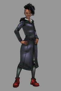
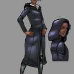
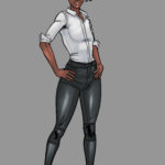
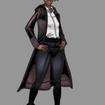
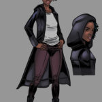
Scout Turner
– Lead character, late 20s.
– I’m picturing a hooded, fashionable, long, leather coat with a sleek outfit underneath, like a grey shirt and black pants. Iconic but modern. She could have weapons in her jacket, or medical supplies – we don’t know
– Samira Wiley could play this character
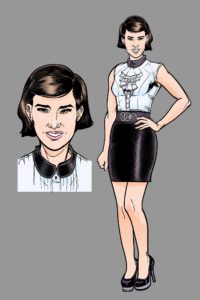 Grace-Eisley Wellington Burke
– Imagine the energy of Zosia Mamet
– Short, bouncy, excited, peppy
– Incredibly expressive face, we always know what she is feeling
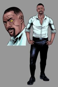 Arthur ‘Arty’ Mathis
– Scout’s boss
– A Tony Stark type character, with a monster’s eye where one of his eyes was cut out
– Handsome, suave, cunning, and caring
– Early 40s, dresses in button-ups with the sleeves rolled up usually
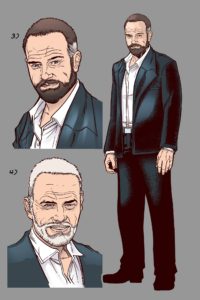 Merk Kenilworth
– The main villain of the series
– Head of pharmaceutical company
– We can model him after Walter White, perhaps, but more in demeanor than appearance
– He can have a cool, calculating exterior. He doesn’t look creepy… instead he looks personable and gentle
Drinkers
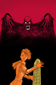
– Let’s make a super fucked up hybrid between a vampire and a dementor. These will be the main threat in the story, and they work as Kenilworth’s thugs. Let’s make them super inhuman, something to really scare the readers.
Pictured Above: An unused cover idea for Breathless #2
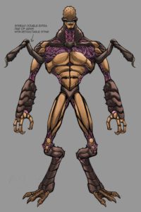
Hissers
– These are the monsters that have a cure for asthma in their venom
– We can make them kind of like the flytraps from Hellchild, but nastier, without a human form. They can be more alien, much stranger and more gross.
COVERS
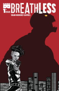
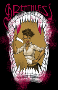
From there, Renzo and I began to plan a series of covers that would stop someone dead in their tracks if they saw them on the shelves. We went through some trial and error, playing with perspective and limited color palettes as you can see above with our cover featuring the original Drinker design. Another early idea for a cover was this:
We ended up using the first image in the piece, with Scout in front of the city as a monster rears its head in the background. Simple, but iconic, I think – I loved the idea of replicating the unique feel of old school horror movie posters with this first cover. Once we had that image, it was time to get weird. I can’t show all of the series covers (#3 is one of my favorite images of anything I’ve ever worked on, so big kudos to Renzo), but here are two more covers and the concept that I gave to Renzo. You’ll be able to see what Renzo and I refined as we moved the covers from concept to final image.
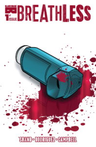
Breathless #1 – Variant Cover Concept: Black background. An inhaler lay on its side in a puddle of blood. Super simple!
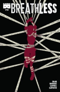
Breathless #2 – Cover Concept: Let’s go weird with this one, also a little funny. Scout, covered in blood, is floating through nothingness, tangled up in a seemingly never-ending pharmacy receipt (like the one we saw on #1, Page Two). The background – the nothingness – is mostly black, but through it, we can see the faint faces of monsters, almost as if they are pressing through the air, trying to get to Scout. If we pull this idea off right, most folks won’t even notice the monster faces until they take a closer look.
BREATHLESS #1 IS AVAILABLE FOR PRE-ORDER NOW
Thanks for taking a look behind-the-scenes and getting an idea of what sparked Breathless. Read more about Scout, Grace-Eisley, and their world of monsters and mayhem this March. Pre-order Breathless from Black Mask Studios today!

