 I think Bitch Planet as a whole is summed up very well from Kelly Sue DeConnick and Valentine Leandro themselves
“TRIPLE FEATURE is an anthology companion to the main BITCH PLANET series, which is a dystopian, Feminist sci-fi take on exploitation genres that attempts to be both satirical and intersectional…
The basic premise (of Bitch Planet) is a literal patriarchy called “the New Protectorate” has taken power, and women who displease the Fathers are labelled non-compliant (“NC”). The most non-compliant are shipped to an off-world prison colloquially known as “Bitch Planet.”..
The stories in TRIPLE FEATURE take place in the world of BITCH PLANET and, in some small ways, the two books intersect. We consider TRIPLE FEATURE to be both additive and independent – meaning, you don’t have to read them to follow the main title”.
WARNING: THIS IS A MATURE READERS TITLE ONLY.
Foreword:
You know, sometimes working as a Reviewer can be tough going. While you have the option of rejecting material, indeed, most of my work I select either from the IndieComiX editorial submissions listing, or have independently sourced material.
It can be difficult delivering hard news, but a critique is designed for the purpose of providing feedback that is useful, by providing commentary on faults and dynamics that may cause a detrimental impact on the work itself, its purpose; for review and improvement.
Rarely do you get works that are a literal joy to read and review, but Bitch Planet is that rare little gem. In case I’m still being vague here, I love this series, it’s one of the smartest, funniest and thought-provoking series’ on the market today.
Some time back, I’d heard about this series, I mean, let’s face it, the title is a little difficult to forget, it’s also as wonderfully “Grindhouse” in title, as well as art.
Of course, in this day and age, that really counts for little, between the exhibitionists and over-enthusiastic people out there, I’ve seen plenty of books that promise so much, many of them are also very pretty to look at, but completely lack the substance they purport and promise to us.
There’s also the over-use of popular imagery, the “CMYK fad” (I’ve honestly lost count of how many indie books I’ve seen that have tried covering appalling “artwork” with CMYK colours in a bid to excuse it as “arty”, they’re usually titled with something provocative and stupid, like “Beat Me, My Name Is Derek”, or some equally abysmal title) and OH! GRINDHOUSE!!
Seriously, things like this are done to DEATH!! No more, I beseech thee!!
But then someone comes along and surprises you.
You see, it’s not seeing it again one more time that sickens us at the sight of something, but the fact we’ve been promised so much, over and over again, only to leave us feeling ripped off and having even less faith in the next one, so I could be forgiven for my apprehension in picking up a title that was so unashamed in its cover design as “Bitch Planet”.
But I had to admit, it was among the best design work I’d seen in years, the art itself was attractive, and the production was about as good as I could ever hope for, so after perusing the aisles of the London Comic Mart around a year or so ago, I found BP for about £5-6 (which I think is equivalent to about 79c post-Brexit, but I digress).
I took a proper look at this baby, finally. “Okay… I’m going to give you a chance”, I said to myself – internally, mind (“don’t annoy the crazy person”), and if I were being perfectly honest, I couldn’t wait to get reading it on the way home.
That didn’t quite happen, but I did devour it with gusto the following day, and what I found was the new brightest star in my sky.
The only thing I’d known Kelly Sue DeConnick for prior to BP was Captain Marvel over at Marvel Comics, I’d never been tempted enough to lure me to even really give it a look, so I was going in unarmed, so to speak.
What we have here is very clear that it’s a Feminist book from the very get-go. Okay, I know some of you are sick of hearing “buzzwords” and how “everything is political nowadays”, and how you just want to get away from it all, but 2 things;
1) Everything already is Politics, you just probably didn’t notice before, because you’re not supposed to notice.
2) You know, it is possible to make a solid point AND entertain people at the same time!
Kelly Sue describes the mood of BP in BPTF as being in the satirical vein of “Robocop”, and I can certainly see that likening, but what caught my attention, what I saw, was very John Carpenter, circa his classic period.
Although his films could be very dark in places, there was also a lot of humour, which we’d seen in “Escape From New York”, “Big Trouble In Little China”, and never more so than in “They Live”, the latter being the strongest in commonality with BP in its themes, albeit, that was in regards to programmed consumerism.
The premise is pure Sci-Fi in its best form; take a prospect, positive or negative in nature, then drive it to its most logical conclusion. Which is usually something that freaks people out or deeply excites them. In the case of Bondage, it’s both.
Which is what we have here, both in the main title and in Bitch Planet Triple Feature. (Sci-Fi, not Bondage!)
BPTF is a collection of some of the finest, but often lesser known talent from around the world, mostly consisting of people from marginalised groups, which is a nice theme to start on, given the nature of what this book is about, giving prominence and exposure and… Dare I say??
Equality in their contribution to this series.
Now it’s a wide and varied bunch for you here, I’d wondered if it was Kelly Sue and Valentine doing a spin-off series, possibly an “Appendix” to the main book, then found it was being done by people I’d mostly never heard of.
Okay, not a problem in itself, let’s see what they have to offer. Keeping an open mind is what led me to chancing this book in the first place.
BPTF is an eclectic mix of styles in its contributions, no 2 tales look the same, every one of them very separate in thought and rendition, but all of them that I’ve read have the same thing in common, whatever other differences there may be; they are all VERY Bitch Planet.
Why, you’d be forgiven for thinking there’s an allegory there for what it means to be Human, despite what sets us apart (surely not??!)
And so after that very long intro, I give you tonight’s main presentation; BITCH PLANET TRIPLE FEATURE SPECIAL!
A triple bill of triple bills!!
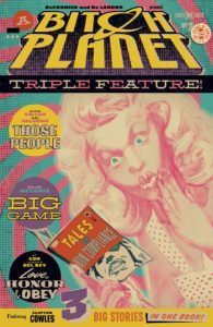
BITCH PLANET TRIPLE FEATURE #1
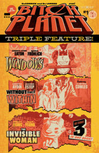 Cover by: Valentine Leandro
Cover design and logo design by: Rian Hughes
Backmatter design by: Laurenn McCubbin
Lettering by: Clayton Cowles
“Windows” – Cheryl Lynn Eaton and Maria Fröhlich
Summary: Lupe is ex-miltary, with 6 years under her belt, including a tour of Orion. She has just return from 2 years of service as a Nurse from the Auxillary Compliance Post, also known as “Bitch Planet”, the prison where the most undesirable Non-Compliants go to be “reformed” and “re-educated”.
Returning to Earth, she seeks out a new life in “Civvy Street”, obtaining a new line of work, adjusting to it after 8 years, but doing so is not so easy, and Lupe’s past 2 years of service hold a dark little secret..
Ever lied on a job application before? Here’s why.
“Without and Within” – Andrew Aydin and Joanna Estep
Summary: And speaking of new jobs, Anna Winter has started working for her new Ward, Gentleman Tommy Rogers.
Rogers is about to deliver his speech on an important piece of legislature in front of The Committee, when he receives a surprise visit from a friend, Gentleman Bisbee McCormick, who has taken a..liking to Anna.
With Gentleman Rogers’ blessing, Bisbee pursues Anna..with the most inconvenience of timing.
As Gentleman Rogers awaits his speech to be delivered to him by Anna, The Chairman also awaits, and The Chairman does not tolerate failure.
“The Invisible Woman” – Conley Lyons and Craig Yeung, with colours by Marco D’Alfonso
Summary: Leslie is a corporate “Go-Getter”..or at least thinks she is. When called for a meeting with her Employer, this is a chance for her big moment, to reach forward, to show him she’s got what it takes to “lead the troops” and pursue the corporate dream, to finally be acknowledged and respected.
Leslie is about to receive a solid lesson in self-respect, in a way she had not expected.
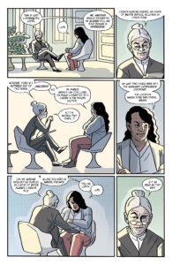 Review: “Windows” – It’s a bold thing to go first, especially when you are stepping into established shoes, for that reason alone, you have to admire Writer, Cheryl Lynn Eaton and Artist, Maria Fröhlich.
Hitting off on a high note, Eaton’s script is dialogue-rich and strong in dialogue usage and variation. This is encouraging from the start, what we see unravelling is masterful in its unveiling of the story, peeling back layer after layer, until the story’s final conclusion. There’s some clever narrative tools used in here, which I won’t go into, see if you spot them.
It’s wondrous seeing a Writer’s mind working as you slink through the story, not one page is wasted on anything superfluous, which considering it has 8 pages in which to do so, I didn’t get the feeling any further elaboration was needed. It’s a full story, a smart story, and I have no room for fault here.
Art-wise, well, everything is subjective in art, I suppose, however, I did feel that in places that the style and use of kinesis felt a little..“Cartoonish” in style, additionally the colours had a similar ambiance, leaving me feeling they were a little on the too flat side, and a bit on the pastel end of the colour spectrum for my taste, later, the colour darkens to a more apt tone of what we’re used to from the main title.
Sadly, this where an initial problem arises with ‘going first’ – comparisons are inevitable. With that said, one has to ask the question as a Reader, “is that a fair thing to do?” Perhaps not, but an understandable reaction.
“Without And Within” – Its difference in art style is the most distinct this issue, Joanna Estep’s art style and colour palette instantly strikes you as quite “Anime”, not that there’s essentially anything wrong with that as such, but it took a greater adjustment than the previous story, from this point in, I allowed any preconceptions I had to go out of the window.
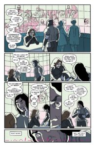 Which, frankly, is better, because in this respect, it lends a hand to the preceding tale, “Windows”, that as the reader, I should drop any comparatives to what I’m used to, that the individualism of these works are now autonomous and allow themselves their own voice. Which is exactly the aim.
Unfortunately, though well scripted, the story here feels a little too linear and predictable for my liking, its under-lying theme of “the woman is wrong, whatever she does” seems too accessible far too early.
I felt much the same when I saw Fruit Chan’s “Dumplings” offering on the ‘tryptich’ film “The Three Extremes”, I don’t like it when I can see the conclusion and point half-way through a story, I feel like I’m only ‘seeing it out’ after that point, and I felt much the same here, even so, despite my feeling this was the weaker of the 3 stories in this issue, it still remains a reflective perspective in the world of BP.
“The Invisible Woman” – Now this was a return the colour palettes we’re used to in Bitch Planet, Marco D’Alfonso’s flats, the ‘half-tones’ (and I hope one of my art Lecturer friends, Guy Lawley, doesn’t pull me up about my usage of that term), form-fit the easy-on-the-eye line-work of Craig Yeung beautifully.
It’s clean and crisp work, inviting us back into the world we know and love in BP, despite any other stylistic differences, it’s pure BP from the start.
Connie Lyon’s script is as leaned-down and minimalistic as the art, cutting to the bare essentials and pleasingly avoids an over-convoluted dialogue, which is great, leaving cues for the art to shine here, such as Mr. Babcock and his bitch of a PA erupting with laughter, it’s a divine moment of pure characterisation, both in a literary and visual sense.
By far my favourite yarn here overall as a piece of the three, though I must confess my partiality, story-wise for Cheryl Lynn Eaton’s “Windows” as being the most fulfilling experience so far.
A very good debut issue, from all parties concerned, that remains true to the spirit of BP, leaving you curious and craving for more new voices and their conjecture.
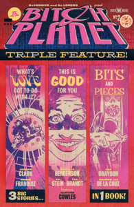 BITCH PLANET TRIPLE FEATURE #2
Cover by: Valentine Leandro
Cover design and logo design by: Rian Hughes
Backmatter design by: Laurenn McCubbin
Lettering by: Clayton Cowles
“Bits And Pieces” – Che Grayson and Sharon Lee De La Cruz
Summary: It’s the 9th annual “Miss Tween Neck” competition! It’s all about those long and elegant necks of yours, as you grow into young women! It’s time to smile, put on a happy face for the most prestigious award a young lady could hope for!
Stay beautiful, kid! For your own sake.
“This Is Good For You” – Danielle Henderson, Ro Stein and Ted Brandt
Summary: Ladies, ladies, ladies. The Patriarch knows what’s best for you. You may not know it just yet, but all you really need is a little “re-education”, just accept it, the Patriarch loves you and wants you to be happy.
You only THINK you want that hair cut right now, but trust in the Patriarch, by the end of the film, you’ll see things differently, and the best part about it all is it was YOUR idea!
A guide to what makes you a “real woman” in the world of Bitch Planet, from the perspective of The Patriarch. Now sit back and enjoy the movie.
Don’t slouch now, that’s most unlady-like!
“What’s Love Got To Do With It” – Jordan Clark and Naomi Franquiz
Summary: Maya has hit 30, working too many hours at the Hospital, at this rate, she’ll never find a man!
The dating game is a rough sea out there, especially when you’ve got to “that” point, now it’s time to have “that” conversation. You know, the one where your Parents will lose the “Old Maid Tax” if you don’t get that fat hiney of yours into gear, shape up, find a man and settle down! Compliance is obligatory!
Mother knows best, I’m sorry, but you really ought to be ovulating by now.
 Review: Boy, was this a fun issue to read!
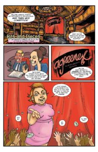
“Bits And Pieces” – While the art from Sharon Lee De La Cruz in this opener wasn’t to my usual tastes, feeling very rough and too sketchy for my liking, it’s still a surprisingly good fit for Che Grayson’s Comedic approach to the whole “America’s Got Talent/Beauty Pageant” thing.
This is an enjoyable satire, focusing upon the undue pressures of children growing into young adults, it’s not shy in its statement, utilising an “Absurdist” approach in both the exaggerated art and a script that oozes sarcasm, irony and some very dark humour.
“This Is Good For You” – In all honesty, Danielle Henderson, Ro Stein and Ted Brandt, in literary and artistic terms, have encapsulated a very strong part of the BP universe, walking us through a hilarious take on the “50’s Housewife” showreel.
You can tell Danielle was really having a ball with this one, the humour is scathing and biting, with the “real world” parts feeling real and the fantastical parts gleefully skipping along to its own delusional melody, it’s almost as light and as fluffy as that Strawberry Mousse the Patriarch wants you to make!
Frankly, I should know better than to mention about Strawberry Mousse, that was a mistake, now I’m thinking about it. So are you. Ahhh, you lucky git, you can go get some of that good stuff any time you damn well want! I have to keep writing here! >grrrmble-mumble<
There is no justice in the world!
“What’s Love Got To Do With It” – Jordan Clark and Naomi Franquiz
I’ve got to admit, it’s a bit of a hard act to follow when you come after a story that makes you want to go grab Strawberry Mousse…or maybe some FroYo?? Hmm. It’s good for you..you could have just a little bit..
Right! Back on point! Sorry, went to that ‘dreamy’ place for a moment there. I admit it, Jessica Alba was waiting with spoons.
Anyway, “What’s Love Got To Do With It” not only follows on nicely, but also brings me back down to Earth and keeps me away from Strawberry desserts.
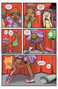 This one has a really warm charm to it, it really draws you in, and so very well-paced, I actually thought it was longer than the mere 8 pages it has to make its mark.
And it definitely does. The art and the story have an aesthetic of the Hernandez Brothers “Love And Rockets”, it’s playful and wry in humour, taking moments of parody to the closest point it can until you realise its there.
There’s very much an “everyday life” feel about it, anchoring you into the world, where previous tales here have shown just the satirical aspect.
Maya is one warm, yet cool Chica.
The sign of any really good story is that you miss it when it’s gone. I loved you, Maya, if only for a few minutes. Wait, that came out wrong.
 BITCH PLANET TRIPLE FEATURE #3
Cover by: Valentine Leandro
Cover design and logo design by: Rian Hughes
Backmatter design by: Laurenn McCubbin
Lettering by: Clayton Cowles (except on “Those People”)
“Those People” – Alissa Sallah and Alec Valerius
Summary: A new Protectorate unit prowls the jungles in search of an NC resistance cell, as its new recruits ready themselves for action, nothing can prepare them for the horrors that await them.
One for anyone that’s ever been on a protest.
“Big Game”- Dylan Meconis
Summary: A predator lurks, abducting young kin, and it’s up to a new Deputy, out on his first recovery mission with his senior from the Family Asset Recovery Agency, to bag the predator and keep the world safe from these wayward creatures.
“we’re in the business of family reunions.”
“Love, Honor & Obey” – Kit Cox and Vanesa R. Del Rey
Summary: When a Mr. Craig Hornby is found dead, after being in the company of Betty, one of Father Shiner’s girls, it’s down to a Detective to solve the case of how Mr. Hornby died, and to establish what part Betty may have played in his death…
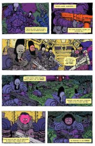 Review: “Those People” – Style-wise, the art from Alec Valerius here is another that took some adjusting to for me, which is unusual, given that it’s quite reminiscent of a ‘European’ style, again, another “Cartoonish” feel to it, but I quickly adjusted with this, and in fact, the style fits very well with the script from Alissa Sallah.
Given this is satirical, it also has a very serious tone to it simultaneously, which is where art & script meet perfectly.
It’s interesting that I drew some personal conclusions from this one, as I noted in the summary for this short, anyone that’s been on a protest knows full well how quickly the most peaceful of protests can get out of hand, simply by one wrong element, setting off a powder keg.
This one made me feel something, affecting my innate need to change the world the world around me for the better, and the forces around you that prevent that.
When violence erupts in a protest, the only thing you’ll ever see on the evening news is about the violence, everything else is forgotten, which is the entire point in the first place. That last comment has a dual meaning to it, think about it.
“Big Game”- Although I’d sussed out from mostly the beginning about where this story was leading, I believe that’s the idea, I’m pretty sure you’ve probably figured it out yourself by now, given the themes I’ve discussed here.
But this is one of those occasions when this knowledge is irrelevant, the story here is within its unfolding. It’s very dialogue-driven, and the more than passing resemblance of the senior Officer here to Sam Elliott is probably entirely coincidental, but adds to that “experienced guy” feel to the character.
It’s a simple, but fun little romp, and while I can’t claim it brings anything major to the BP universe, sometimes that doesn’t matter, just like nature, sometimes you’ve got to just let something be what it is.
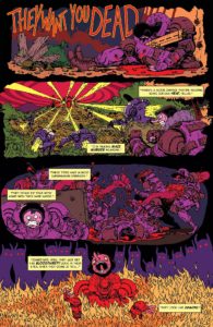 “Love, Honor & Obey” – I don’t know quite what it is about Vanesa R. Del Rey’s work that reminds me of Tula Lotay, I mean, their work looks nothing alike, but when I discovered both of their work some time ago, Lotay’s work on “Supreme Blue Rose”, Del Rey on “Scarlett Witch”, there really seemed to be no connection at all.
Then I remembered Del Rey’s work on the BOOM! Studios “Hit” and it struck me.
Both do that remarkable “Noir” thing very well.
This story’s art is a little rougher in style than usual for Del Rey, more like sketch work, though I seriously doubt this was done out of speed requirements (I could be wrong, but I doubt it), but rather, a different feel for a Detective story to encapsulate the vagueness of the situation the characters are in.
Everything is vague, especially to Betty, our Leading Lady Of The Night, who really isn’t sure if she’s done anything wrong herself, let alone the Detective.
The Kit Cox script carries it well, like a long lost story for a backing short to some Pulp classic, I mean, come on, with names like Kit Cox and Vanesa R. Del Rey both of these folks even SOUND like they’re from a Pulp novel!
This is pretty enjoyable, a cool little change in feel, especially since this is the first offering in only greyscale (well it’s Noir, what did you expect?), rounding off this wee collection so far.
In summary:
A refreshing read, all-round, but that’s not all.
One of the things I loved with Bitch Planet are the hilarious fake ads in the back of the books, I was honestly in tears with some of the stuff that was on those pages, so it’s nice to see the occasional little one crop in the back of the BPTF pages too.
Additional features in all 3 of these issues include creator bios, which just go to show the calibre of the people behind this baby. There’s additional articles on Feminism, Futurism and, well, “Fanism”, if you like as well, with some cosplay back covers of our favourite Non-Compliants.
I can say with absolute certainty that I haven’t read anything as rewarding as Bitch Planet/Bitch Planet Triple Feature since “We Can Never Go Home”. It’s books like these that are genuinely defining the market now, shaping it and re-crafting it into the medium it always should have been.
The Superhero funnies have their own place, but really, it can’t be a surprise that for years, we were hearing “Comics are for kids”… Well… That and “many adults are douchebags”.
We’ve all grown up. So have Comics. This is a shining example of just that.
And yes, I’m buying the book when it’s out, in case you’d not guessed, and will be happy to return to review the final issues of this series. Great work, people.
Bitch Planet Triple Feature #1-3
Image Comics
Writers: Andrew Aydin, Cheryl Lynn Eaton, Conley Lyons, Che Grayson, Danielle Henderson, Jordan Clark, Alissa Sallah, Dylan Meconis, and Kit Cox
Artists: Joanna Estep, Maria Fröhlich, Naomi Franquiz, Ro Stein, Sharon De La Cruz, Ted Brandt, Alec Valerius, Dylan Meconis, and Vanesa R. Del Rey
Reviewer: Scott Mack

