 If it wasn’t apparent enough from the summary, this is a very specifically local magazine to a State that is rich with art that simply doesn’t get enough love or air to breathe. So why would be reviewing this then? Two reasons: I love anthologies and I’m also an Oklahoma creator. So it was nice when a few weeks ago I got to attend the launch party of this awesome new magazine and rub shoulders with some of the people who made it happen. I don’t really get to hang out with any comic creators in real life so it was thrilling to, for once, feel personally like I’m a part of something bigger.
It’s a feeling that I get only slightly at anime conventions being around people who enjoy the same things I do. However, this time it was on another level. Meeting people who do the same things I do. Not just loving them. But, as all of you who read this site know by now I’m not one to mince words simply for people I know or talk to outside of these reviews. Tell good stories and I will say good things about them in return. That’s how it has always worked.
Thankfully, and truthfully, this debut magazine is really good. And you don’t necessarily have to be an Oklahoman to understand it either. While some of locations are super specific to Oklahoma as a state, any one of them can be picked up and simply read as a story. One is informative, a few are comedic, some are heartwarming. But all of them are fun. And like any anthology, none of them tell something that is super specific to a larger story. At least not yet.
This is the tricky part about anthologies and why I love reading/reviewing them. The challenge of telling a complete, satisfying story in only a few pages is fascinating and not everyone can do it. Often they fill incomplete or unfulfilling. Leaving more questions than they answered or setting up for something larger down the line. Lord knows I’m guilty of both of those things with my own stories.
But upon reading the first issue I was delighted to see every single story fill a space and tell a completely solid story in whatever way it was trying to tell it. So let’s break them down. This first issue contains the following (all stories are written by Jeff Provine in this debut issue):
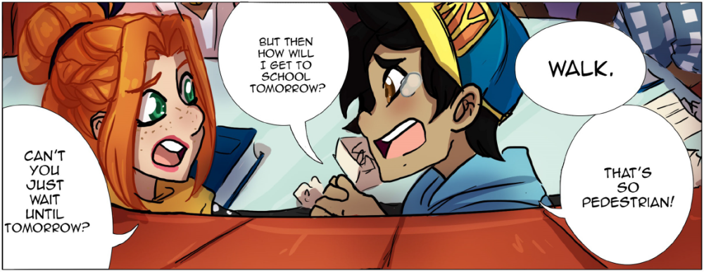
The Kids of Couch High School in ‘The Late Night Pick-Up’
Art by: Shelby Soto
This is a comedic tale of a boy who leaves his skateboard at school and wants to get it back. Unfortunately what should have been a simple journey turns into a fun adventure as he and his friends find themselves caught up in a local crime that was definitely not in their high school curriculum. The writing is witty and never too teen-heavy in a way that so many writers get caught up in. Using Millennial lingo in place of whatever gen Z (the real teens of today) actually say. They talk like normal people and it’s genuinely a breath of fresh air. The art is done is far more manga-esque style than I was expecting to find in this magazine and it was a pleasant surprise. On top of that it’s really good art as well. I really like Soto’s cute, somewhat sketchy style. The characters are adorable and the motion through the panels feel really kinetic. No one ever feels like they’re sitting still and it’s nice to see.
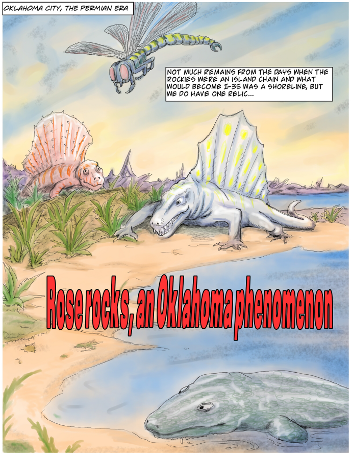 Rose Rocks, an Oklahoma Phenomenon
Art by: Robert Henry
This was one that also took me by surprise. It’s easy to forget that comics can be informative as well as fun, not just all sci-fi and superheroes. In this little adventure we travel from the pre-historic era to modern day as Provine and Henry take us through some of nuanced history of Oklahoma’s famous Rose Rock (exactly what it sounds like, a rock that looks like a rose). I’ve had a few of these throughout my life, or known people who did. They’ve always been cool to me, but to hear Provine tell it there’s this science and mysticism to them even as a fellow Okie I was never aware of. And Henry portrays these stories in gorgeous painted detail. The final page in particular is stunning to look at.
Ballad of Puddin’ McGee
Art by: Katrina Younts
This two-page adventure is told in the style of an old nursery rhyme with a 1920s/1930s gangster setting. Puddin’ McGee, as the story goes, is the most adorablest gangster you ever did see. And that comes across in Younts’ cute, also manga-inspired, art style. The story itself is about McGee attempting to rob a bank and how the banker reacts due to McGee’s pint size’dness. It’s a cute story and both Provine’s ability to make the story sound fun while Younts is able to portray that sense of fun so flawlessly really cements the enjoyment I had with it.
OK 2089
Art by: Nate Shroeder
This is definitely a reference to Blade Runner / 2049 in both its title and feel. That grungy science fiction vibe. Which I’m fine with, I love both all of those things. However, admittedly this is my second to least favorite story of the magazine and the one I feel doesn’t resonate the most with me as a reader. The art is great still if not a little messy at times. I also wasn’t huge on the color palette, I don’t feel it meshed very well with Shoeder’s heavy shading. But I do like his style in general. Overall, what fell the most flat was the story itself and the lettering. The lettering feels messy so it’s hard to follow the narrative a bit but the terminology being thrown around to “get” the story doesn’t feel like it’s being adequately explained. I like this idea of a man just going about his normal routine and then a woman just appears in front of him, and then leaves and then we see how that effects him. But I struggle with how the explanation of her device that causes her to be able to teleport is handled.
 Zooklahoma: Test of the Best
Art by: Scott McClung
Anthropomorphic animals always win me over. It’s so fun to see them dress and act like humans and sometimes when you take the humans out of the human element it becomes easier to see the message being conveyed in the underlying story. Here, however, there is no deep meaning. Just a bunch of deep, deep dishes. And by that I mean pizza. The story focuses on a Buffalo and Prairie Dog as they take dozens of people’s advice to try the different pizza places in Oklahoma City to see which one is the best. It’s fun little story and I quite like McClung’s cartoony style. If anything the coloring felt a little too filled by primary colors but I don’t have a lot to complain about with this one. I liked it.
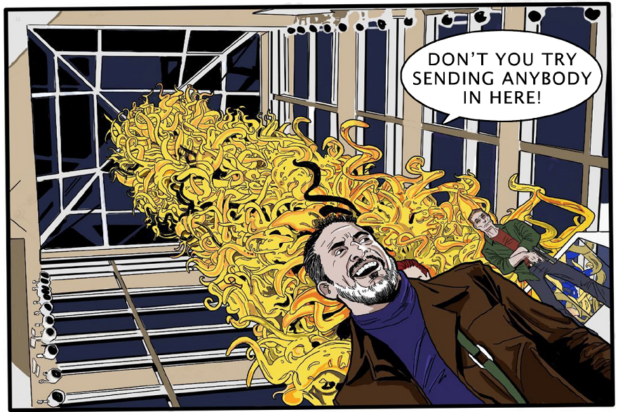
 Introducing the Oklahuman
Art by: Mike Kennedy
Admittedly, the Oklahuman is a silly name. I get the pun. But it’s a silly name. In fact, I would go as far to say that the Oklahuman is my least favorite part of this entire story. While I do like the story, I wonder if the fact that the title character himself doesn’t ever have any lines, he sort of just shows up, shows off his powers, beats some people up, and leaves sort of underscores that he isn’t the most interesting character here. He is a mystery, but the people who have to react to him from the cops to the crooks are far more interesting in how they handle the situation of this superhero suddenly showing up to stop some criminals from messing up the precious art pieces inside the Devon Tower. And the art on this is great, overall. Again, the Oklahuman is the least interesting part of the art and the characters that all look like celebrities hamming it up (see: Cop that looks like Terry Crews) makes this far more compelling of a read for me. There is some gorgeous angle shots in this comic by Kennedy and his colors are great. The dark tones fit this story really well. Give me more people reacting to the Oklahuman and let the hero be a recurring mystery.
It Happened At The Devon Ice Rink
Art by: Scott Sackett
A silent two-pager that sees a couple of kids who are fortunate in getting to skate realizing that there are others who are less fortunate than them is, while a simple comic, and compelling one. There’s nothing special going on here, it’s just a small story about two humans being better humans by seeing an opportunity to help someone and taking it. We need more of that paying it forward attitude right now. I liked this. I also thought the ice cold tones of the colors and the more realistic art style helped drive this home as well. Everything feels real and cold, and that’s a smart choice.
Turn In The Weather
Art by: Brad Gregg
This is my least favorite story. Again, it’s not bad. It’s a silent story and tells a very, very simple one-page story of a man trying to figure out how to deal with the changing weather for his small business as he goes from making homemade hot chocolate in the winter time to something more necessary for the summer. There is commentary here on Oklahomas often and sudden changing weather. It’s true that here one minute you might be in freezing conditions and then what feels like instantly it can go to be 80 degrees out. And how small business owners deal with that takes some genius. I think this is my least favorite comic because it’s the most simple out of all of them. There isn’t a whole lot here to chew on. Which again doesn’t make it a bad comic, just not the one I jumped out of my seat for. The art is fine, it’s very sketchy and basically cartoonish. But I love the stark yellow and blue contrasts of winter and summer. It does make the comic pop.
 Thunderbird
Art: by Jerry Bennett
This is the final story that caps the whole thing off and I think might just have the most page count as well. It’s set in the wild west on the plains as cowboys are forced to deal with a new predator in the form of the fabled “Thunderbird.” This is the one with, well, the best art of the magazine. Which is not that surprising as Bennett has been blessedly tapped to do art for Marvel merch as well as Star Wars merch officially so he’s obviously incredibly talented. The sepia tone coloring was also an inspired choice given the setting. For the story itself, like all the others I do quite enjoy it. I find the cowboys having to deal with how best to react to the “Thunderbird” and then what comes of that to be really interesting. My least favorite thing about the story is the “Thunderbird” itself. I kind of wish it had turned out to be a bit more mystical looking than what it ended up being. However, it definitely subverts your expectations in what you might think something with that name to be versus what it actually is here.
Okie Comics Magazine is one helluva fun and necessary addition to the comic scene in general, not just to Oklahoma. We need more local outlets for creators who struggle to find ways to branch out past their own little corners of the world. Whether that be a writer or an artist, a letterer or an editor, a colorist or a cover designer. All of us a need a place to start and I for one am truly happy we have this now.
And yeah, it’s one helluva great first issue. I can’t wait to check out issue two.
Final Score: 4.5 Truly Local Comic Settings out of 5
You can read the 1st FULL issue here (for FREE):
https://okiecomics.com/2017/12/01/issue-1/
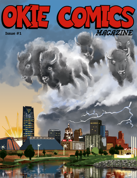
Okie Comics Magazine #1
Self-Published
Writer/Creator: Jeff Provine
Illustrators: Shelby Soto, Robert Henry, Katrina Younts, Nate Shroeder, Scott McClung, Mike Kennedy, Scott Sackett, Brad Gregg, Jerry Bennett
Cover Artist: Matthew Brendle
Reviewer: Derrick Crow
Summary: Okie Comics Magazine is the next development in the blossoming world of Oklahoman art. This bi-monthly, free periodical serves as a showcase anthology for local creators telling local stories, whether directly from Oklahoma’s rich history, set in Oklahoma’s familiar locations, or in a theme that evokes Oklahoma culture, from our wild weather to our Sooner spirit.
I and my sister would like to obtain a couple of your “okie comics. Tell me how to get them. Thanks. Dennis
There is a link down near the bottom of the review where you can read the first issue.