Twenty years, twenty long years has Xing Xin put time and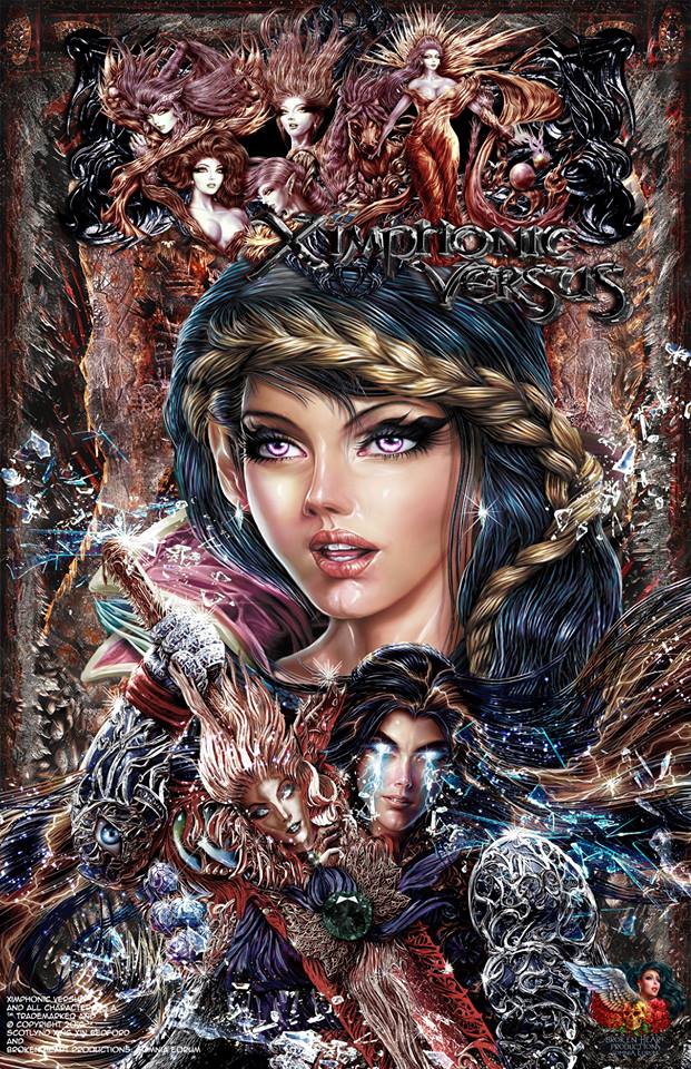 effort into the world of Ximphonic Versus. Something I find to be greatly amazing as that is a serious of amount of dedication to a project. Chances are, you might recall time I had an interview with Xing over all things Ximphonic and Broken Heart Productions! But if you don’t, here’s a helpful reminder to help you out! So many great things has been said about this title and the universe it holds within its pages. And so far, we’ve only seen pages on Facebook and a short preview of the comic book and you know if you’ve a high amount of praise going on despite the limited stuff you’ve put out, you are doing something damn right! The art seen here is video game level styled stuff and I’m jus
t wowed by it to be honest. Something that you know has to have taken a good amount of hours to do to pull off, further showing that dedication Xing has for his baby!
The fact Endro Gatotkaca and Kevin Combs do such fantastic jobs with the colors is also pretty darn great as its clear to see they are just as willing to put the time into this world of Xing’s. Now, we’ve got quite a few fantasy like words in this title and while some would probably be annoyed by that, I’m not and I’m sure those who have read this aren’t either as it shows even more of Xing’s willingness to put in effort to make this so different from other Adventure/Fantasy like stories that’s out and about in the world. The main character Addonnis, who’s something of a Prince with what looks to be electricity constantly coming out of his eyes is someone who’s journey I’m interested to join in on. Especially since it seems he’s out to help help establish a treaty of sorts. A treaty that is only really meant to ease the minds of those under the King that Addonnis and Master Concerto are coming to visit as the treaty becomes a thing.
Though it seems to me that Addonnis and Concerto definitely think fairly highly of themselves and I’m curious to see how that plays out as this story goes on. Especially where Addonnis and his throne is concerned and if whether or not his journey puts him at odds with Concerto. And I gotta say, their driver Coagi looks freaking bad ass in the red and black armor he’s got on! Guy definitely seems like the type I wouldn’t wanna cross! That ever present crystal tear of Concerto’s is another thing I’m fairly curious about as I can imagine there is quite a story involving it! While this is only a preview, we do learn enough to get hooked into wanting more. At least I’m hooked anyway! And I truly hope the time for the full on first issue of Ximphonic Versus is drawing near for us all to feast our eyes on.
Is this Prime Minister we meet at the end a bad guy? No one but Xing knows and I’m sure he’s just bursting to reveal that and so much more! Along with the fact he’s probably ready to bring on the tv show of the comic for the world to witness! I urge everybody to check out this world of his and even the preview as you won’t regret it! This without a doubt, is a true gem in the world of the Indies!
Editor’s Note: Head here to stay up to date on all things Ximphonic Versus!
Ximphonic Versus Preview
Broken Heart Productions: Somnia Eorum
Creator, Artist, and Writer: Xing Xin
Colorists: Endro Gatotkaca and Kevin Combs
Letterer: Taylor Esposito
Reviewer: Rob Wrecks
Summary: In a contemporary and Gothic world ruled by Victorian Dynasties, Modern City Kingdom’s, Magical Beings and Mystical Swords Of Power. A prince seeks to reclaim his throne as he must make a choice between two evil’s and the woman he loves.
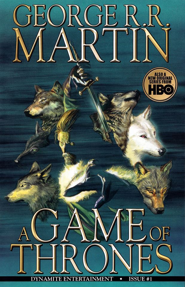 A Game of Thrones Vol. 1
Issues #1-6
Dynamite Entertainment
Creator: George R.R. Martin
Writer: Daniel Abraham
Illustrator: Tommy Patterson
Letterer: Marshall Dillion
Colorist: Ivan Nunes
Reviewer: Derrick Crow
Summary: This comic adapts George R.R. Martin’s illustrious novel series A Song of Ice and Fire with the first book in the saga, A Game of Thrones. This volume collects the first 6 issues.
Review: Every medium of A Song of Ice and Fire is a chore to power through. And this adaptation isn’t necessarily any different. However, when reading the books or watching the show generally that chore is wading through the layers upon layers of characters and dense mythology Martin has created. And with every new installment the story grows that much more engrossing and fascinating to experience.
Through the course of these first 6 issues I found myself wondering more often than not if I felt like this was an adequate adaptation or not of the source material. I’m a huge fan of both the books and the show that it felt only right to hold this version of the tale up to as high regards as them. Sadly, whilst it isn’t a mess of an adaptation and actually does pretty good in some areas, overall I found myself not really enjoying the bulk of the story.
Why is that, however? Well a lot of is with the inclusion of whole bouts of narration that works for a purely written narrative like the books but doesn’t necessarily work in comics. I’ve long been outspoken against the use of too many narration captions overfilling pages. Hell, if it were up to me I’d bring back thought bubbles for characters. But my main gripe is generally when writers use them to describe what’s going on in a scene that I can clearly see with my own eyes within the very panel its explaining to me.
 Here we have sort of the opposite problem. Because of the visual medium of comics events have to move along at a steady pace and so you have to focus on what’s important to the story without wasting too much time describing things that simply don’t matter. In a book there’s a lot more leeway to this simply because a person can’t see what you’re typing so they have to imagine every little detail.
In A Game of Thrones the comic adaptation Abraham chooses to rip text straight out of the book of scenes that happen to characters in-between the important events. So you’ll get scenes of Ned Stark riding in on his horse to the King’s court with the narration caption overtaking the panel describing exactly what it was he was doing before he arrived within the confines of his bed chamber (it wasn’t dirty).
And this takes up most of the book, so while we do get to see a lot generally the narrative captions don’t match up with what we’re looking at and instead talk about stuff we don’t need explained to us. If you’re describing something that happened to a character or is currently happening to a character make sure it’s important to the story. If I as a reader can skip reading the narrative captions altogether and the story still make perfect sense than they’re unnecessary and should be taken out.
On top of that however the script just isn’t very strong as the story feels like it does move too fast at times and moves too slow at others. Now, I know pacing is a hard thing to master in any medium. Both the original books and the show have tons of trouble with this at times. But at least with those incarnations the flow of the story almost always feels on point. Most of this problem is the first few issues where events sort of jump back and forth without any real flow. As we get to latter half of this first volume the pacing begins to really even out so I’m confident that the comic will get better in that sense as the series continues.
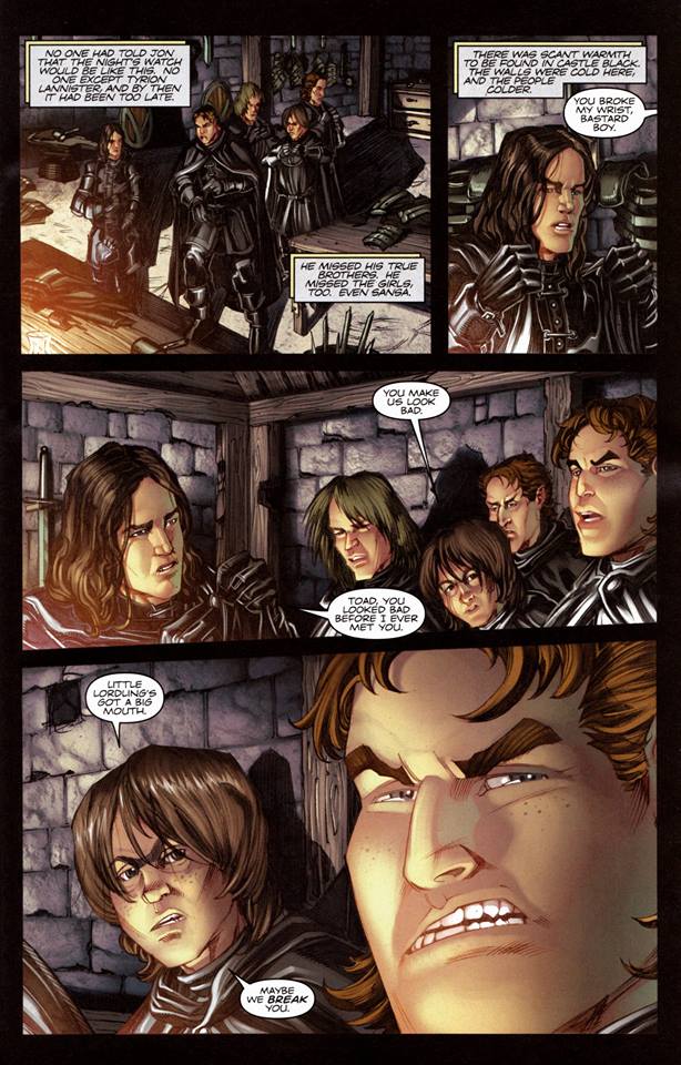 The art by Patterson was another chore for me as overall I’m just not a fan of the blocky style he gives to our characters. And sometimes I can’t even tell characters a part. Sansa literally looks like a slightly shorter version of her mother, and both Lord Commander Mormont and Grand Maester Pycelle looks exactly alike just with more liver spots placed on top of Pycelle’s head. It also doesn’t help that there were sometimes panels seemed to shift focus on what was happening on a dime with characters just going rogue on the page before returning to their place within the story.
Everyone is very stiff throughout this first volume as well. Generally when some moves on a page the trick is to make the shift as fluid looking as possible. Patterson just doesn’t succeed in that department as any movement made by a character often looks like a statue moving either suddenly or ever so slightly an it can be jarring. One upside in Patterson’s art however is most of he time the characters at the very least look their age. With the exception of Daenerys, though that’s because she’s supposed to be a sexually active 13 year old. And I can fully understand not wanting to make her look actually 13.
I do like looking at some of the characters because unlike the TV show where everyone is aged up as to bypass the whole preteen fiasco this comic through Patterson’s artwork really does portray many of the characters as their age. And as someone who is used to a somewhat older Catelyn Stark it’s quite interesting to gave upon one who looks like she’s supposed to be in her 30’s like in the original books. The same goes with a Jon Snow that looks like he’s actually 14, not mid-20’s like in the show.
I sense this series will get better in time, and I do hope Dynamite gets the opportunity to adapt the other books as well because I would really like to see that, but for now the opening volume to this series is a bit underwhelming sad to say. I will continue reading however because I love me some more Game of Thrones and I’m curious to see how faithful this comic continues to be.
Final Score: 3 Stone Dragon Eggs out of 5
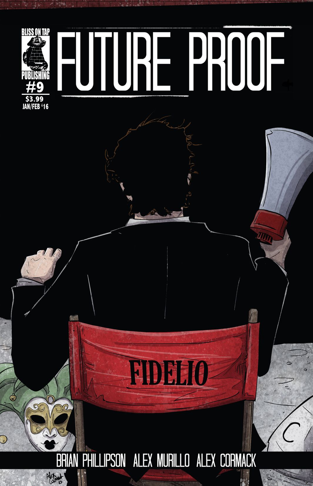 Future Proof #9
Bliss on Tap Publishing 2014
Written, Lettered & Book Design by: Alex Murillo
Illustrated by: Alex Cormack
Coloured by: Alex & Ashley Cormack
Reviewer: Steven Leitman
Summary: The one-way time-traveling adventure continues as everyone’s favorite agents James and Simon visit a secret location to put the ‘con’ in the infamous moon landing conspiracy. Was the Apollo 11 moon landing real or just a Hollywood film production devised as a back-up plan to a possible failed mission?
I’m bad I know it’s been way too long since I’ve visited the boys and this series. Cataloging my collection reminded me I have a few issues to review still so here we are. The boys have a very drunk and passed out Edgar Allen Poe on a train in 1849 to open this story. While the boys are keeping an eye on Poe doing what Poe loves to do most, drink apparently, it’s an opportunity for Alex to do a little more serious background characterization.
Simon Magus has always been the more serious of the two and here we get a nice chance to see him in his life before he started this whole time traveling business. His family saying goodbye and him in a mission that we don’t get to see the result of just that it’s something that causes him to have waking nightmares. It’s great characterisation because it really just wets the appetite for more. Plus we get that nice glimpse behind the curtain as it were and it’s this interjected into the silliness that James get him into that balances it all out.
 Speaking of the silliness I love how they get to their final destination this issue. It’s superbly thought out and executed. Plus it gets the story suddenly much larger and the scope of Sing and it’s agents.
I am such a fan of Alex’s interiors. I’ve watched him grow and take that talent he has and hone it, tighten it up and make it something great. The flow of the story through the page layouts with the use of angles and perspective are fantastic. The two page spread in those outfits is amazing to see finished. The uniqueness of their faces, their expressions and the emotions the pictures bring really help this series shine.
This series is the best time traveling conspiracy theory story you’ll have the pleasure to read. I mean it’s a tongue in cheek/serious look at those events that people think they know the truth about or that the theorize about the different things other than the public reality of them. It’s just one of the great escapes with the perfect buddy pair to hit comics since Blue & Gold!
Editor’s Note: Head here to stay up to date on all things Future Proof and as well as Bliss On Tap!
 Man Vs. Rock TPB
Self Published
Story: Victor Detroy and Kevin Bieber
Art: Jared Lamp
Colors: Summer Fitzgerald
Reviewer: Rob Wrecks
Summary: “The only thing we have to FEAR, is FEAR itself … and the rocks!” – Barack Obama, 1942.
The premise behind Man vs. Rock is simple, powerful, and original: Buck Stone, a slow-witted child in rural Alabama, is bullied by the other children because of his leg braces. Undeterred by his shortcomings, Buck is able to break the barriers around him to start a successful shrimping company, become a world class ping pong champion, earn a Purple Heart for bravery in Vietnam, and father a young Haley Joel Osmont.
If that sounds like the plot of a certain Tom Hanks film, you’re wrong, and you’ll be hearing from our lawyers very shortly!
I am honestly sorry I didn’t read this TPB sooner. Victor Detroy and Kevin Bieber have come up with something here that is so ridiculous yet so damned amusing it belongs in the history that is Classic Literature. The idea of rocks being a cause of problems and even wanting revenge after milions of years is a concept that shouldn’t even work but it does. It works so damned well that I have to wonder if Victor and Kevin are part rock themselves since they were able to pull this comic book off. You can tell the guys had a damn good time writing this storyline and if it doesn’t get some sort of animated or live action adaptation, that’ll be a damn crime in my view. Jared Lamp’s art style honestly makes me think of the art style used for the first Heavy Metal animated film and cause of that, I think this would make for an ideal choice for Heavy Metal to adapt and make use of the art for it. Well, if they were looking for something highly of the ridiculously absurd but amusing as Hell variety anyway.
Buck Stone isn’t your average hero, or your average teacher for that matter. Matter of fact, he’d probably make other heroes and teachers so damned appalled by how he acts that both would want him as far from those two things as possible. Only to come crying his way when the rocks actually start doing what he claims they’ll do. And I can only assume that in this world Victor and Kevin have come up with, that there’s no such thing as small boobs. Which likely only really helps add to the crazyness seen in this book. The guys also pretty much touch on nearly every topic in today’s society and flips it all on its many heads, leaving you at the most, amused or possibly offended. So if you’re easily offended, this might not be for you. But hey, give it a try anyway as who knows, you might just enjoy it! God knows thirteen pages in and I was all sorts of amused and wondering a little what the creators were smoking when they came up with this idea.
But did a rock truly make Buck’s ex-wife Victoria (who’s now Vice President baby!) cheat on him? Or is he far too paranoid for his own good? Can a rock truly make one a heterosexual? Answers and more for you to find out on your own as you feast your eyes on this wildly ridiculous adventure! Though, you may not wanna let the kids read it. They might get scarred or become rocktivists or something crazy like that! I kinda have to wonder though after all is said and done if Humanity will come to hate Buck. Cause at one point, he’s in a prime position to do something about the rocks’ threat. Course he’s liable to let them do whatever act of retribution against him for failing to do what he always had intended to do so!
Four volumes of insanity, memorable characters, and moments that makes you have a strong need to know what happens next all in one place for 19.99! Now you can’t beat that baby! Unless you don’t have a strong need then something might be wrong with you! So with that said and in the words of Ryback… FEED. ME. MORE!
 Love from the Shadows OGN
Fantagraphics Books Inc.
Creator, Writer, and Artist: Gilbert Hernandez
Reviewer: Derrick Crow
Summary: Love from the Shadows is the latest standalone graphic novel from Love and Rockets’ Gilbert Hernandez – a hallucinatory, violent, and sexy crime thriller involving a pair of siblings, a coveted inheritance, a gang of supernatural scam artists, a dubious sex change – and throughout the story, in guises real, fictional, and imagined, the one and only Rosalba “Fritz” Martinez of High Soft Lisp fame!
[[SPOILERS!!]]
Review: Love from the Shadows is nothing if not a peculiar read. A bit of basic research tells me that this is a spin-off book of Hernandez’ aforementioned Love and Rockets series, sort of a film within that universe being told in its own publication. Which I think is pretty cool. But after finishing the story I found myself more confused about what I had just read than when I began.
The problem here is that Hernandez has a difficult time as the storyteller and artist in conveying to me, the reader, exactly what little symbolic thing means when the dialogue as well as the flow of the story doesn’t match up with whatever he’s trying to tell me. For instance, there is a cave seen near the beginning of the story, near the middle, and at the very end that is supposed to – I assume because I’m forced to pull straws here – symbolize Dolores’ constant turmoil and loneliness within her world as an aging spinster who has yet to settle down and find a person who loves her for her.
And again everything else that happens before and after those scenes with the cave doesn’t help to convey that. For instance the beginning of the story shows Dolores in an abusive relationship with a man we’ll see later and when she attempts to get away from him she finds herself in another body, but she doesn’t seem to change at all personality wise. She calls up her brother Sonny and they decide to visit their successful writer of a father who’s disappointed in how both of his kids turn out.
 Several other events happen that involve her father dying in the cave, Dolores running off to hooch it up with a trio of scam artists – one of which is the aforementioned guy from the beginning who she also kills at the end of the book before undergoing plastic surgery to become the girl she was at the beginning of the book before entering the cave for the first time. We also get some supernatural guys named Monitors who seem to be monitoring Dolores’ journey and they’re called Monitors. They remind me a lot of the Observers from the TV show Fringe. Ultimately they have very little impact on the story and I’m not really sure why they were there in the first place.
If any of this ties into the other “movies” from Love and Rockets that were made into comics or if any of this ties into the main story itself then I wish Hernandez would have found a better way of incorporating those connections into this story without making the reader feel lost by their inclusions.
If there’s any save grace to this story it’s that both Dolores and Sonny’s character arcs are – within the confines of the main story involving their family and personal struggles – pretty good. Dolores is lost and alone. She’s about to turn 40, she moves from guy to guy and overall seems lost in the world because nothing has worked out for her. Her father is disappointed in her. At the end of the day it’s her relationship with her brother that seems to be her anchor and even that’s not enough to keep her from running away from her troubles at the end.
Sonny is gay and that’s important because it’s the biggest reason his father is disappointed in him, and like Dolores he’s pushing 40 and his life hasn’t exactly worked out for him either. Their father may be disappointed in them both for being – in his eyes – failures, but at the end of the day he’s more proud of Dolores because she isn’t gay. This becomes cemented at the end of the book when Sonny finds out his father left Dolores 27 million dollars in his passing.
Without Dolores around to collect however and with no way of reaching her, Sonny chooses to undergo plastic surgery of his own to become Dolores so that he can collect the 27 million dollars. Making a deal with the surgeon so that no one later finds out. Of course even that doesn’t last forever as through freak of nature Sonny becomes returning to his former male self after so long. But hey, he’s rich now, so what does it matter?
Love from the Shadows I believe is ultimately about broken families and the harsh reality that not always do these broken bonds get mended and often times we will still find ourselves alone in the universe. It’s a hard reality check but a needed one for those who may find themselves in a bubble where nothing bad ever happens.
The other strength of the book is Hernandez’s art. Which is very simple and not really detailed in the slightest but that’s okay because not all art has to be. It’s got a sort of playful whimsy to it that I enjoy. And yes, those familiar with Hernandez’s art or even by just looking at the pages sorted through this very article will probably notice he has a particular way of drawing his women.
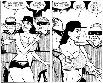 Giant boobs, curvy and un-proportionally skinny bodies. Yeah, by 2016 standards many people would cry foul at this because it’s not realistic enough and its too over sexualized. When you read the book you’ll at least realize Hernandez is thankfully not shy about giving the guys he draws the same amount of fanservice. You see just as much penis in this as you do exposed breasts. So it doesn’t really bother me. At the end of the day I really enjoy Hernandez’s art style and read more of it.
This book definitely has shooed me away from reading anything else in the Love and Rockets universe, and I will probably pick up more along the way to see what those stories are like. But as its own standalone story, Love from the Shadows doesn’t exactly hit the mark like it meant to.
Final Score: 2.5 Trippy Sex Changes out of 5
Editor’s Note: Wanting to check this out for yourself? Then head on over to here and grab up a copy!
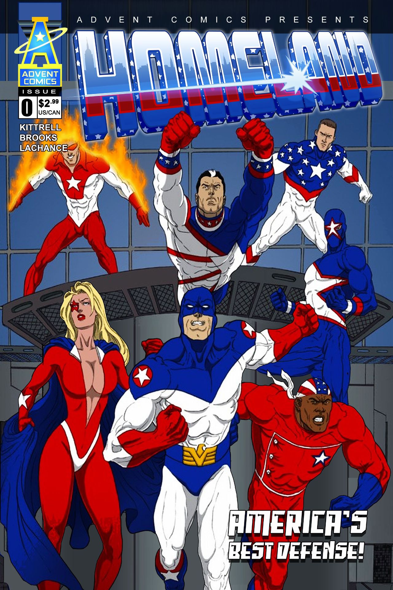 Project Homeland #0
Advent Comics 2016
Written by: Tony Kittrell & J. Scott Webb
Illustrated by: Bart Sears, Austin Brooks & Martin Blanco
Coloured by: Martin Blanco & Rachel LaChance
Lettered by: Shawn DePasquale
Reviewer: Steven Leitman
Summary: This series chronicles the adventures of the brave men & women of America’s covert Project: Homeland Program and their struggle as America’s frontline defense against all enemies – foreign, domestic and superhuman!
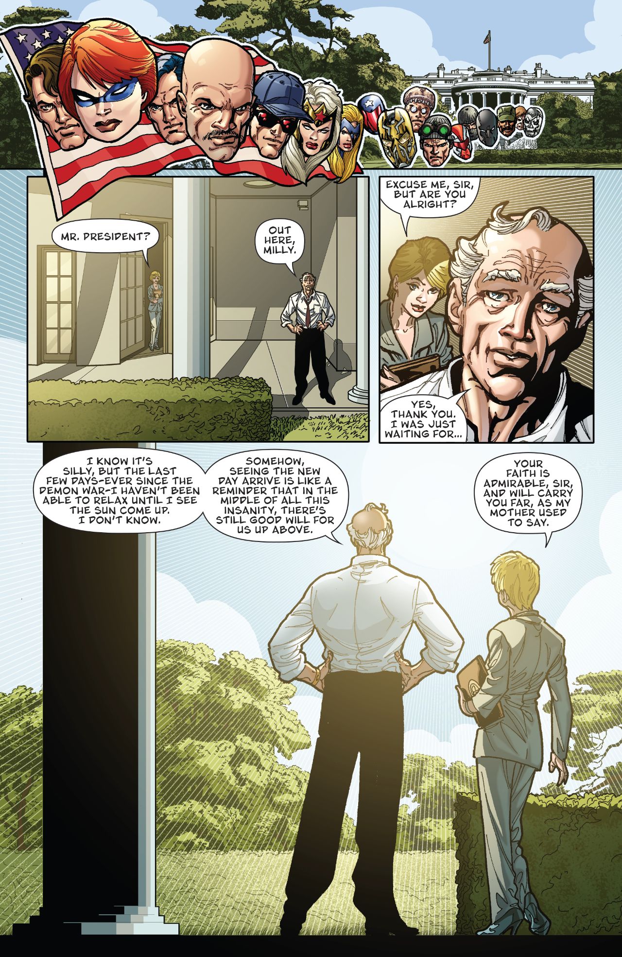
Well colour me intrigued I like the premise here as it’s really a Government team of heroes. We’ve seen them in comics in the past and usually they are somewhat unstable or overzealous and come across harsher or like the bad guys to heroes who already operate. What Tony and Scott do this issue is go about it a completely new way though and I think they do a great job of it.
This first issue is a bit wordy but that’s okay because it’s needed to help the reader understand the state of this world and why Project Homeland is needed. It’s also a bit wordy because it focuses on the President of the United States and his inner circle and we all know how much they like to talk, usually over one another. Still there was a worldwide event that has caused the need for the formation of a Government formed team of superheroes. This is the aftermath as they discuss what’s happened and options for moving forward.
I’m really rather quite impressed with how the story progressed, the characterization and the fact that we start after a huge event that isn’t in the series. Also go on ahead for Bart Sears’ work on this one as well. It’s nice to see his work again and I have it looks as good as anything else he’s ever done if not better. The linework is fantastic, the attention to detail and his eye for storytelling, using angles perspective, poses and backgrounds all really pop here. There are plenty of moments that are subtle that stand out and impress.
I also like that while these folks who run our government introduce a few characters as well as be who they are, they are the President’s advisors for a reason, there is some levity in the writing in unexpected ways. It’s nice to see the kind of balance between the seriousness of what’s happening and the character depiction that paints moments we can truly appreciate as we get to know them.
 The second story here focuses on one man. He was a member of the NYFD during 9/11 and after that event he signed up to serve his country. This was when the fledgling Project Homeland was put together and he was one of the first to be trained and put into the field.
Again a very good look at this early team, it’s failure and what that meant for it’s members and the possibility for what it is to come. His code name Triumph is now more aptly suited to him after the events we see unfold this issue. I think he’s going to be one to keep an eye on because of everything he’s gone through. His narration and story make him what I see as a strong leader for those who are up and coming and he’s a good solid character himself.
The interiors are good and i like that this was done as it was with not a lot of empty space in the panels. You get a great sense of what’s going on here in the bigger picture as well as the emotions and feelings to help the story have a bigger impact.
I will recommend this to you so head over to www.adventcomics.com for print copies or digital which are available at ComiXology and ask your local shoppe to carry them as well. This is is why diversity in comics is so important, not just in companies and the variety of creators able to shine but within the characters created themselves. This is good solid storytelling with nice strong interiors. I expect a lot of good things to come from this company.